

Logos of UTokyo Faculties, Graduate Schools and Institutes, in the order of their creation
Logos of UTokyo Faculties, Graduate Schools and Institutes
In the order of their creation
Tracing the history of organizations through their logosIn the spirit of the special feature of this edition of Tansei, we present UTokyo organization logos here in chronological order (please keep in mind that some organizations do not have logos). The thoughts put into expressing the characteristics of each organization as well as the trends at the time can be seen through the various designs. As a bonus, the UTokyo mascots who devote their days to PR activities are featured, too.
1948
“Ginkgo Badge” Logo

Professor Shoichi Hoshino from the Second Faculty of Engineering designed the original ginkgo logo, which was selected from 79 designs that were put forward.
1956
Graduate School of Medicine / Faculty of Medicine
This logo was created in celebration of their 100th anniversary. Designed by Professor Tomio Ogata, it features a design of the Akamon Gate, which used to be the Graduate School/Faculty of Medicine’s gate.
1982
The Institute for Solid State Physics

This logo features the acronym ISSP in the center, with five ginkgo leaves surrounding it. This design was selected from public submissions for the 25th anniversary of the Institute.
1988
Graduate School of Pharmaceutical Sciences / Faculty of Pharmaceutical Sciences
The ginkgo leaves have been arranged to create the Greek letter Φ (phi), which signifies pharmaceutical sciences, with the stem of the leaves forming the infinity symbol ∞. The logo thereby expresses that “the Faculty of Pharmaceutical Sciences will last forever.”
1992
Institute of Medical Science

This logo celebrates the 100th anniversary of the Institute. The double helix structure of DNA is shaped in a circle, representing either a cell or a virion (virus particle).
1994
Earthquake Research Institute

The inner structure of the Earth is presented like a sliced-open apple. This was designed by Jun Kawahara who was a graduate student at the time.
1994
Institute for Molecular and Cellular Biosciences
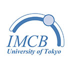
With the reorganization of the Institute of Applied Microbiology, they invited people to submit logo designs, and this particular one was selected by faculty and staff. (The Institute became the Institute for Quantitative Biosciences in April 2018.)
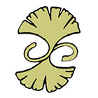
1999
Graduate School of Arts and Sciences / College of Arts and Sciences

The logo features three ginkgo leaves fused together, representing the Junior Division, the Senior Division, and the Graduate School. It was designed by ZEN Corporation’s Shizuo Ishizuka.
2000
Interfaculty Initiative in Information Studies/Graduate School of Interdisciplinary Information Studies (III/GSII)

The logo is composed of three “i”s. The superscript dots on the “i” are shifted to the right, signifying the interdisciplinary ties of academic fields.
2001
Institute for Advanced Studies on Asia
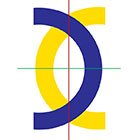
The logo is inspired by the oracle bone script for “east” (東). The blue and yellow arcs signify the Asian and non-Asian regions, and the intersection of the red and green lines represents the Institute.
2004
UTokyo Logo

This logo was created upon the incorporation of the University. Its design is based on the original ginkgo badge; the yellow leaf on top is the autumnal ginkgo color, and the bottom leaf is the school color.
2004
Graduate School of Information Science and Technology

This logo features their acronym IST combined with a ginkgo leaf, the UTokyo symbol.
2004
Graduate School of Public Policy

With the intent of international outreach, they decided upon the acronym “GraSPP” and turned it into this logo. Faculty members chose the logo from a selection put forward by a design company.
2005
Institute for Cosmic Ray Research

This logo, designed by Kenichi Tsuchiya, was selected from submissions by Institute members. The design is inspired by a scientific phenomena such as supernovas, gravitational waves and Cherenkov radiation.
2006
Graduate School of Mathematical Sciences

A ginkgo leaf is formed with geodesic lines, and the shape extending upwards symbolizes the spreading of research. This was designed by Professor Toshitake Kohno.
2006
Graduate School of Engineering / Faculty of Engineering

Three circles are playfully connected to form a “T” for Technology. The two different colors represent the Faculty and the Graduate School.
2007
Graduate School of Science / Faculty of Science

The blue part of the logo is in the shape of the hiragana “り” (ri) for rigakubu (Faculty of Science), and the yellow is the “S” for Science. The high degree of symmetry displayed in this logo hints at the intrinsic qualities of the Faculty of Science.
2010
Graduate School of Humanities and Sociology / Faculty of Letters
This logo was created to coincide with their website redesign. Embedded in these characters is the message that the Faculty of Letters is a place to immerse oneself in thought about humankind.
2010
Atmosphere and Ocean Research Institute
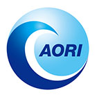
This logo is inspired by Hokusai’s The Great Wave off Kanagawa, portraying the Institute’s willingness to take on the challenge of solving the mysteries of nature. It was designed by Yukiko Imada.
2011
Graduate School of Agricultural and Life Sciences / Faculty of Agriculture

The letter “A” for Agriculture is formed using ginkgo leaves, and the logo also features the double helix structure of DNA. Shoko Takahashi’s design was selected from public submissions.
2011
Graduate School of Frontier Sciences

This logo depicts both the fresh and autumnal leaves of an oak (kashiwa) tree. The spreading branches suggest growth potential into new fields as well as networks with other disciplines.
2014
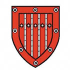
Institute of Social Science

The four blades represent law, politics, economics and sociology, forming a “ninja star of knowledge” through which we can see the world.
2016
Institute of Industrial Science

It features an updated ginkgo badge, as the Institute was previously the Second School of Engineering. The original design was further refined in 2016.
2017
Research Center for Advanced Science and Technology

They revamped the logo for their 30th anniversary. The motif is the Building 13 clock tower. It was designed by Hideo Kanbara, a visiting researcher.
An album of in-house mascots (in the order of creation)
2005
UTas-kun

This crow that came from outer space is the mascot for the academic system UTask-Web.
2006
Komato-chan

This character is the building of Komaba Library. It likes students who enjoy reading.
2006
Icho-kun

The gingko leaf character of Gakunai Koho (internal university magazine). Originally used as page filler.
2006
Hara-nyan

The Harassment Counseling Center’s resident cat.
2007
UTokyo-Twins

UTokyo reagent website’s twin cats (their names are Tokio and Unio).
2007
Komakkero

This frog is Komaba Festival’s mascot, who resides in the Komaba Pond.
2007
U-Tan, Gustoff, Akamon-jii


These mascots were selected from public submissions for the 130th anniversary of UTokyo.
2009
Ichiko

Created for the Seven Universities Athletic Meet, this is the official mascot of the Athletic Foundation. His name comes from the First Higher School (abbreviated Ichiko).
2009
Miyo-chan

This cat features in the compilation Tōdai Eitan (The University of Tokyo Handbook of Academic Vocabulary) published by the Department of English Language, College of Arts and Sciences.
2010
Kimera-kun

He was created for the 10th anniversary of III/GSII. He lives in the tropical rainforest of information and knowledge.
2010
Morikamo

This duck promoted the “Action Scenario” put forth by former President Junichi Hamada.
2011
ISTy

This is the 10th year anniversary character for the Graduate School of Information Science and Technology.
2012
Mei

This sheep, who likes paper and ginkgo nuts, is the official mascot for the May Festival.
2012
Gorokuro

This kappa, who resides in the Gorokuro Pond, is the mascot for Kashiwa Open Campus.
2012
Busseiken

This dog, shaped like a kashiwamochi, is in charge of PR at the Institute for Solid State Physics.
2012
Maillet

Maillet is the PR ambassador for the Atmosphere and Ocean Research Institute and Tohoku Ecosystem-Associated Marine Sciences.
2013
Kotodama-kun

As the Disability Services Office’s mascot, he teaches us about the importance of communication.
2014
Helium-kun and Chisso-chan

They raise awareness for cryogen supply operations and accident prevention at the Cryogenic Research Center.
2015
Nouto-kun

University Library for Agricultural and Life Sciences’ character.
2016
Pipili

Mascot for the Center for Research and Development of Higher Education’s UTokyo TV.
2017
Mememou

Mascot for the Center for Research and Development of Higher Education’s UTokyo Navi.
*The years do not indicate when these organizations were established.
**The logos are presented here without the accompanying text.
Note: This article was originally printed in Tansei 36 (Japanese language only). All information in this article is as of March 2018.