


University logo gets (slightly) new look from April
UTokyo establishes Visual Identity for “a university that anyone in the world would want to join”
The University of Tokyo logo will have a fresh, new modern look beginning from the academic year kicking off on April 1, 2024. To find out about the reason and purpose for the change, as well as some key characteristics of the new logo, we caught up with Executive Vice President Miki Iwamura, who formed and led a study group to consider the logo renewal and was instrumental in moving the discussion forward, while bearing in mind the University’s guidelines. We also point out some key features introduced in UTokyo’s new Visual Identity Guidelines.

- Miki Iwamura, Executive Vice President
- Currently vice president of marketing for Asia Pacific and Japan at Google Japan, in a career spanning advertising, consulting, brand management and academia.
Appointed UTokyo executive vice president in April 2021. Author of Work Smart (Chuokoron-Shinsha, 2016) and other publications. Graduated from the College of Arts and Sciences, the University of Tokyo.
Visualizing UTokyo’s brand value
From the time I became an executive vice president of the University of Tokyo, I felt the University needed to establish a Visual Identity — referring to the suite of design elements applied to visualize and convey a brand’s value. Among the goals specified in UTokyo Compass, a statement of the guiding principles of the University announced in 2021, is to cultivate support and appreciation for the roles performed by UTokyo, and it sets out to “develop a management system toward the establishment of a new UTokyo brand” to carry out this objective. Toward this end, we formed a study group to explore the establishment of a Visual Identity, and through workshops conducted with faculty and staff participating from various departments, we found that University members took pride in UTokyo’s dedication to research contributing to the global public good, among other laudable attributes. On the other hand, the members also pointed out that although our diverse student body and faculty are tackling novel challenges, for the most part this work was not being communicated effectively to society.
In practice, the communication styles applied to the University’s myriad printed materials and Web content vary greatly, according to the organization or project in charge. When looking at the output, one does not get the impression that these products are coming from the same institution — i.e., the University of Tokyo. I felt that for us to become the “university that anyone in the world would want to join,” we need to convey a consistent brand image overseas. At the same time, in Japan, we can seize this chance provided by a unified Visual Identity for all members of the UTokyo community to draw on the strengths of the University’s strong master brand.
A more modern, friendly logo
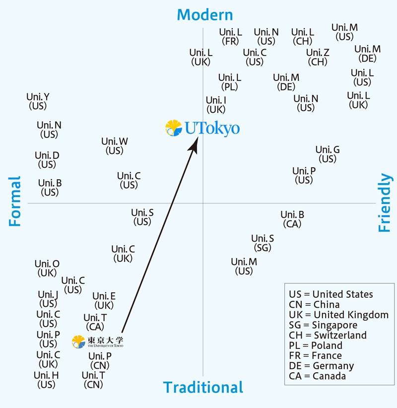
When studying the logo, the core component of any Visual Identity, we collected many examples of university logos from around the world, and plotted them onto a positioning map, based on characteristics along two axes — a vertical axis characterizing the logos’ qualities as being “modern” or “traditional,” and a horizontal axis indicating the degree to which they are “friendly” or “formal.” The current UTokyo logo was positioned in a quadrant characterizing it as having traditional-formal qualities. Nowadays, the primary method of communications is via digital means, and design that is simple, intuitive, and therefore easy to understand, regardless of the medium, has become the standard. When Google — where I am currently a vice president — updated its logo in 2015, it did so along these lines. The way things were made in a paper-based era, by its very nature, differs from that of the digital age. The principles behind the Material Design system, introduced by Google in 2014, is now the norm. As mobile platforms have become the prevailing method of information exchange, attaining high visibility on a small screen is essential. Based on these considerations, we decided on a Visual Identity that was friendly, rather than formal, and aligned with the future, rather than the past and tradition.
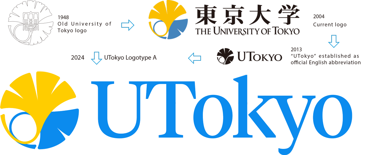
Regarding the letters, or text component, of the logo, we decided to apply the pale blue shade of the school color tansei, which assumes a bright and open disposition, compared to the austere and imposing impression of black, and emphasized the combination of the pale blue with yellow. We also updated the font to one with a contemporary style. The most significant change would be the adoption of the abbreviated form of the University name, “UTokyo,” as the main logo. We felt that as the symbol of a university reaching out and open to the world, the letters of the English alphabet were more accessible and had broader appeal than kanji.
This signifies a big change. “UTokyo” is commonly used as the official abbreviation for “The University of Tokyo,” yet many people may not be familiar with it — I, for one, did not know about it until I became a University executive. Meanwhile, the number of people overseas who recognize 東京大学 (the University’s kanji name) or “Todai” (the romanized abbreviated form of the Japanese name), is, regrettably, limited. As a university serving the global public, we dared ourselves to shift direction to elevate our brand recognition. We also created a logo combining the English alphabet and kanji characters (UTokyo Logotype C) as an option so we could serve various needs and situations, and established the Visual Identity Guidelines for UTokyo members. The Visual Identity is aimed to be accessible to the University community and available for anyone to use, provided they adhere to the usage rules, and we hope members make wide use of it.
Dawn of the “UTokyo” era
The UTokyo Logotype serves as the symbol of the University, a place that people from around the world would want to join in times of great change. We encourage you to use the logo freely in combination with your department’s logo, when interacting and communicating with people externally — for academic conferences, presentations, meetings and so on. We’re ushering in a new era of bringing the “UTokyo” brand to the fore and we invite you to join the movement forging ahead toward a new UTokyo.
If I were to apply the “T-shirt test,” of whether to wear a shirt bearing a particular logo or not, I think I surely would want to if it were the new UTokyo Logotype. At the time when I took on my current role as executive vice president, I put out a message in the pages of this publication to “Unlock the Potential!” I hope the new logo proves to be a springboard toward that end.
Key features introduced in Visual Identity Guidelines
Use with department logo, name

The UTokyo Logotype can be combined with the existing logo of a department or other entity (sub-brand), by placing a divider line in the center, with the UTokyo Logotype placed on the left side and the sub-brand logo on the right side of the line. In cases where an organization does not have a logo, the name of the organization (in English text and using the designated font) can be placed alongside the UTokyo Logotype.
Recommended fonts and colors
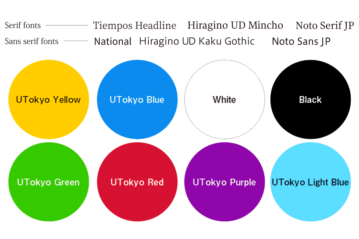
The Visual Identity Guidelines recommend using the eight brand colors designated for three design directions assigned to different communication situations. In addition, six fonts, comprising both serif and sans serif types, are provided in the guidelines.
Simplified application process for UTokyo members (faculty, staff and students)
Until now, the application process for logo usage involved initial request via email, a subsequent review by the Public Relations Group, waiting for permission and submitting the final data. From now on, the process will be simplified to filling out an online form and downloading the logo data. This will allow UTokyo members to use the logo freely without delay. (Use by alumni associations and research collaborations will be subject to review, as until now.)
*For more information, refer to the Visual Identity Guidelines
This is a translation of an article originally published in Japanese in Gakunai Koho No. 1579 (Japanese language only). All information in this article is as of February 2024.